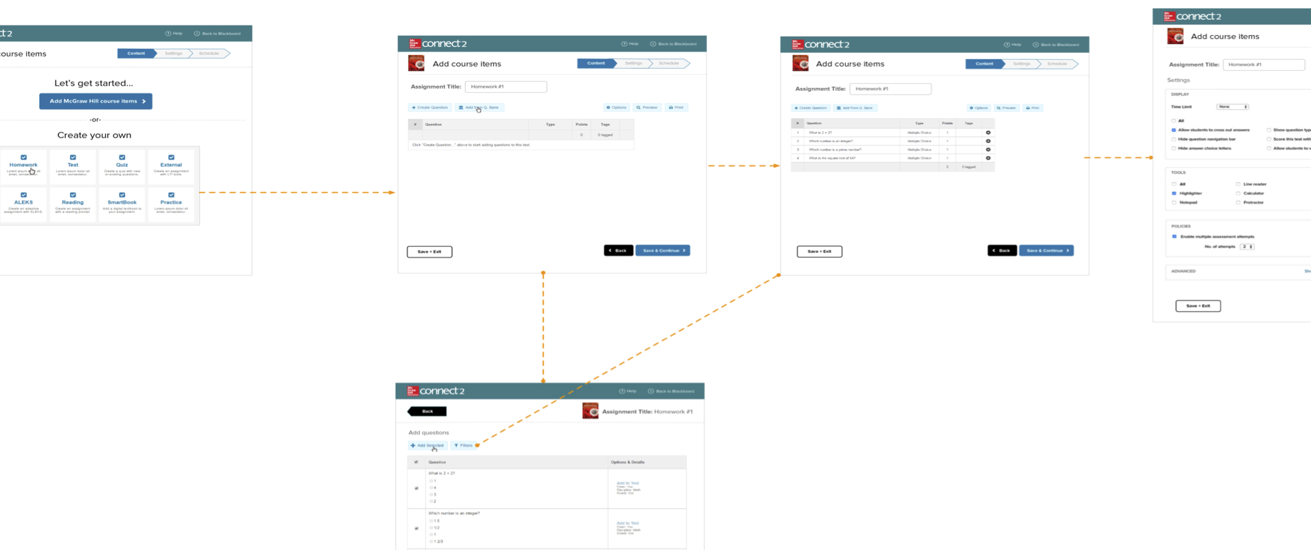
Collected screenshots that started to show us the flow
McGraw-Hill was building a next-generation platform to provide services to university students, professors, and adminstrations. Those constituents used a host of other software for their work, and our platform needed to connect to the ecosystem easily in order for it to be appealing to them. My team was tasked with designing the connection.
Business Problem: One piece of software in the ecosystem was critical for us to connect to: the learning management system. Without a successful integration with the major learning management systems, the new platform would not survive in the market, leaving the company with an antiquated offering in the form of its existing product. It is no exaggeration to say the company's competitive advantage with thousands of customers, representing millions of users, was at stake.
2 UX Designers
Visual Designer
Copywriter
User Researcher
Lead Product Manager
Project Manager
UX Lead and Team Manager
5 weeks
Functional Prototype
The software landscape that university professors inhabited was fractured and always changing. Our job was to make it simple and straightforward for them to use our content and products in the context of their existing software ecosystem, whatever that might include.
We knew we had to work with the flows of the third-party systems to surface our key content and assignment functionality. At the same time, some of our functionality duplicated what they used in the other systems, so we had to suppress any such duplications on our side.
We would need to adapt different flows from our product in new combinations and then apply consistency in the designs and overlay new navigational context. And all of this would have to be accomplished by sticking as closely as possible to the original flows so that we could contain the scope of development work. Managing the project was also complex, since it involved three teams in three time zones.
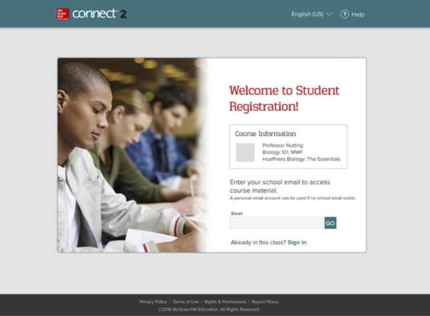
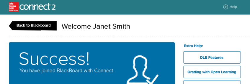
An existing page in our product
I chose to assign multiple designers. Everyone on the team had other commitments at the time, and bringing more people into the mix also brought more ideas to the table and allowed us to take advantage of individual strengths.
The team knew the users and scenarios well, having worked with similar integrations with our flagship product, so we jumped right into sketching the experience, working with a whiteboard to outline the screens, the flows, and the integration touchpoints.
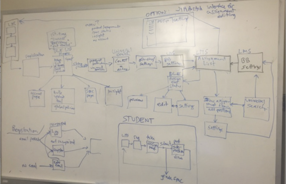
Our reference sketch
We knew our users and their contexts well, from our collective years of experience with our products and people who used them, so we were well acquainted with the habits, goals, pain points, and technology situations we would need to design for. We also had access to data from a survey on the topic.
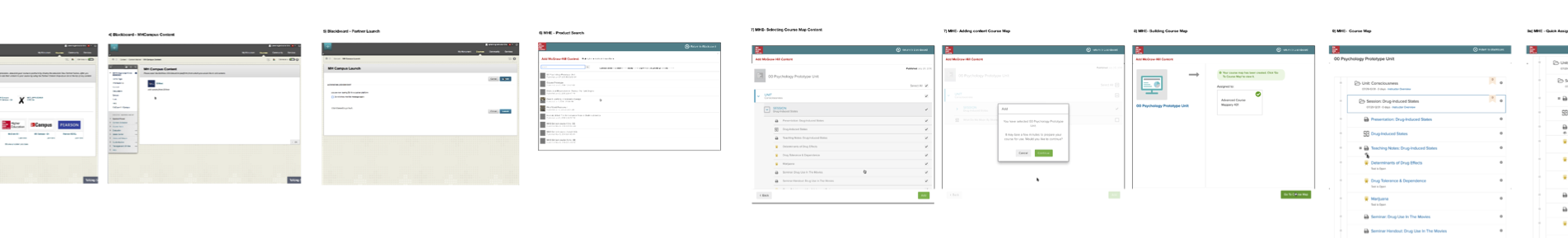
Our first step when we came to designing was to take an inventory of all the screens in the flows involved. One UX designer took screenshots of existing screens and laid them out. We could then identify some gaps which needed new wireframes.
Collected screenshots that started to show us the flow
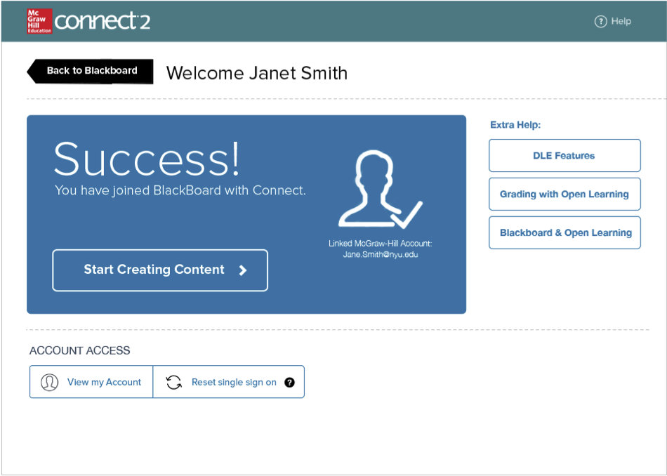
I tasked the second UX designer with looking across the flows and identifying ways to bring consistency into the mix. This meant introducing a common header, to start, but also progress bars and other new elements at times. We paid special attention to the transitional moments, where a professor or student would pass from our system into the other and vice versa.
The copywriter reviewed the copy and the visual designer applied consistent styles to the screens.
We made a first pass at a prototype by loading the visual designs into Invision. This allowed us to get an initial feel for the flows, and the prototype also served to facilitate discussion among the various teams involved. It was also used in presentations to senior sponsors.
The Invision prototype only went so far in demonstrating the experience, however, and a tool like Axure would allow us to show interactions with higher fidelity. We took the time to rebuild the prototype in Axure.
The new prototype had another advantage, which was that we felt confident using it in tests with professors. Over the next weeks, I worked with the Lead Product Manager to iterate on the prototype through stakeholder reviews, and then worked with a User Researcher to go through two rounds of tests with professors.
The results of the sessions with users were generally positive. The most significant learning related to first-time use, and we changed our "welcome" experience to add more context as a result.
In the end, the prototype became our UX document. It was eventually used as the model by the developments teams to build the flows.
I took the initiative to lobby for our team to do this work, arguing that our domain expertise with learning management systems uniquely positioned us to do it, and I was successful. Once we got started, this project posed management and coordination challenges. In addition to the time-management issues in our own team—we all had to juggle multiple commitments—the teams involved in the other locations also had competing commitments that made progress a struggle.
In the end, we hit our deadlines in spite of very aggresive timelines, demonstrated our team’s capabilities, and handed off work that became a critical part of the new products' appeal to professors. The adoption rate of the new product rose after the integration was rolled out.
Next Project ›
646-385-3120
achandler20@gmail.com
Based in New York City