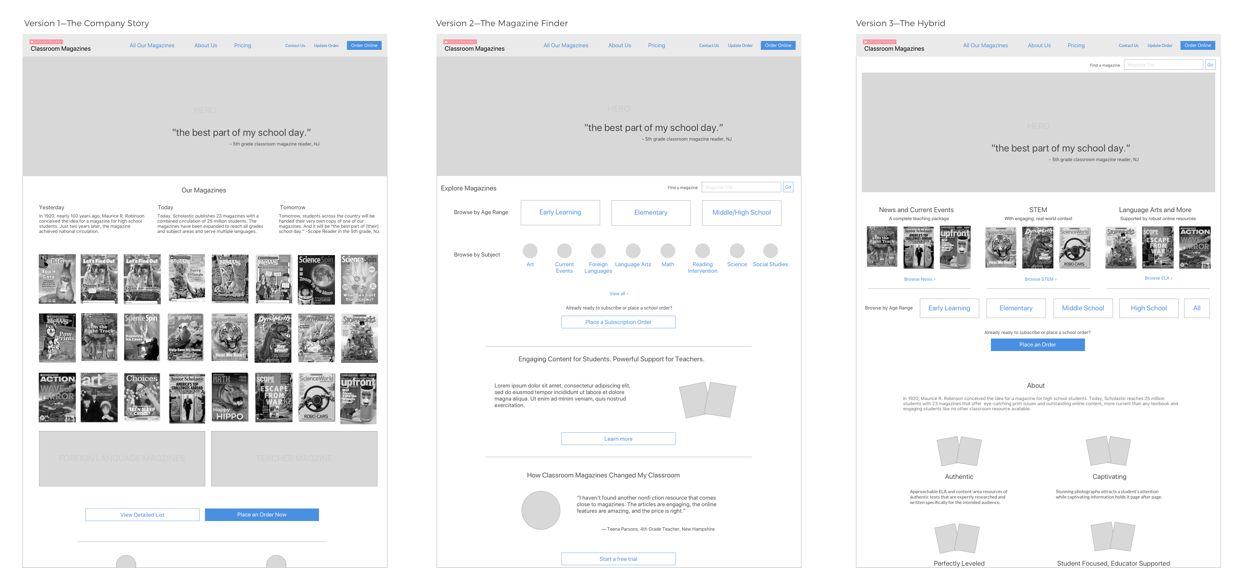
Three sketches showing a range of approaches
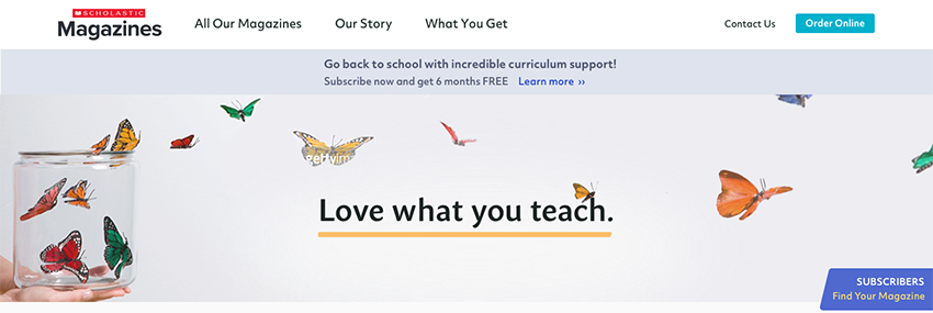
When a teacher or school administrator or other customer of Scholastic's Classroom Magazines visited the company website to browse and subscribe to a magazine, they saw a cluttered page with hundreds of links and many calls-to-action. Anyone would be forgiven for closing their browser and going elsewhere.
Business Problem: The current site performed adequately but was seen to offer many opportunities for improvement. The site was many years old, and there were questions about how efficient the site was in addressing teachers' current needs. Beyond that, there was a desire for a more effective vehicle for delivering marketing messages. Significantly, the purchase flow was also in need of enhancement (see A New eCommerce Flow in this portfolio). When the company undertook a migration to a new content management system, they took the opportunity to address these problems with a redesign.
Two Visual Designers
Marketing Lead
Copywriter
Business Analyst
Program Manager
UX Designer and Team Lead
8 weeks
New Information Architecture and Visual Designs
Correcting the dizzying array of links on the home page—and other pages—would be a matter of focusing the information architecture of the site, which in turn would be an exercise of deciding what would be most important to the teachers. That in turn was an exercise in understanding the reason for their visits.
Tackling the message would prove more of a challenge. The marketing group knew they wanted a more coherent message, but classroom magazines was not a brand itself, being a collection of magazines known more for their titles than for the parent company. The existing website did not provide much direction for our approach. Our task was therefore to distill the common essence from two dozen individual magazines, a diverse and sometimes seemingly irreconcilable group of educational magazines for ages from pre-K to high school, covering subjects from math to remedial reading, and each with a distinct personality.
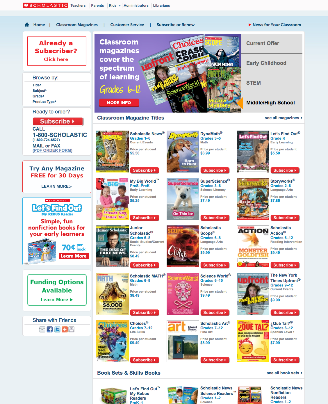
The original website home page, full of links
Once we convened the stakeholders from the marketing department for a kick-off meeting, I started doing my due diligence. In this case, there existed a wealth of research and analysis that was readily available.
I conducted an inventory of pages in the existing site. I had notes from dozens of interviews and usability tests with customers I had done earlier in the year. I had previously created a journey map of the subscription process that was useful in this context. I was able to access web analytics that showed how customers used the existing site. I reviewed competitor websites, as well as some others from other fields to look for relevant trends.
From this research, I ascertained that most visitors to the site were likely to know a lot about our magazines, and beyond that, a good portion of traffic was composed of current subscribers looking to log into their magazine. This pointed to the idea of putting individual magazines in the foreground in place of a more general message. Before committing to this, however, I needed a decision from the marketing department, which was considering using the company story as a component of their messaging.
Aiming to build a robust context for the design, I started by identifying the personas and creating a journey map showing the path a customer might take through the website through multiple visits. Sometimes the journey involved multiple personas.
Tackling the information architecture, I envisioned a radical simplification. From analytics, I knew that a large portion of visitors were existing subscribers who were looking to log into their magazine. The majority of the rest were looking for information on specific magazines. This led me to make a "magazine finder" the centerpiece of the site, while providing a noticeable link to log in for the subscribers. The top-level navigation was filled out with promotional information about the magazines and subscriptions. I created a site map.
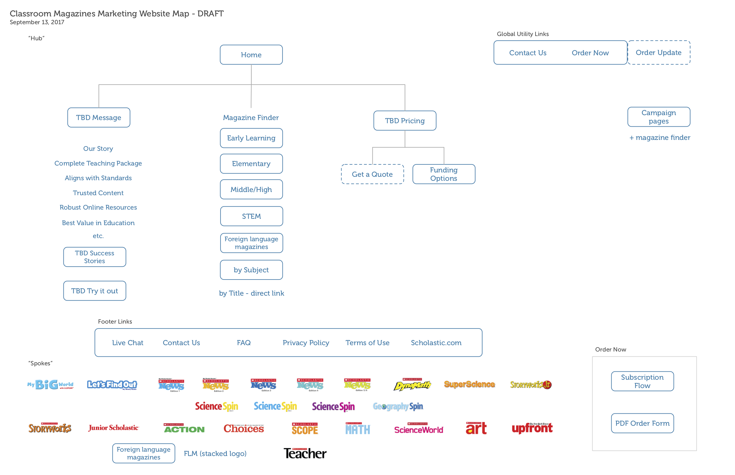
The proposed site map
Before I could start wireframes, I needed the answer to a fundamental question. What story was the website telling? I drafted some sketches showing a range of options to help the marketers make the decision. We had, at one end of the spectrum, the option to tell the corporate story, and at the other, the option to keep the focus on finding a desired product.

Three sketches showing a range of approaches
The sketches generated productive discussion among the group, which settled on a magazine-centric approach, although the corporate story would still be told on a second-level page. I mulled over the best approach to highlight the magazines without favoring one over another and decided to feature categories on the home page. The rest of the site map came into focus, with a central browsing page, supported by "Our Story" and another about what the magazines offer in the classroom.

Meanwhile, I started working with the visual designers to brainstorm a new look-and-feel. We had conducted a survey of stakeholders across the organization about their perception of the "brand" of classroom magazines and what it meant to our customers. To a certain extent the look-and-feel would be tied up with the marketing department's new approach to the message. We also knew that the magazine covers themselves were the stars and our design would be the stage for them. This exploration of colors and typography below is an early document that came out of the process.
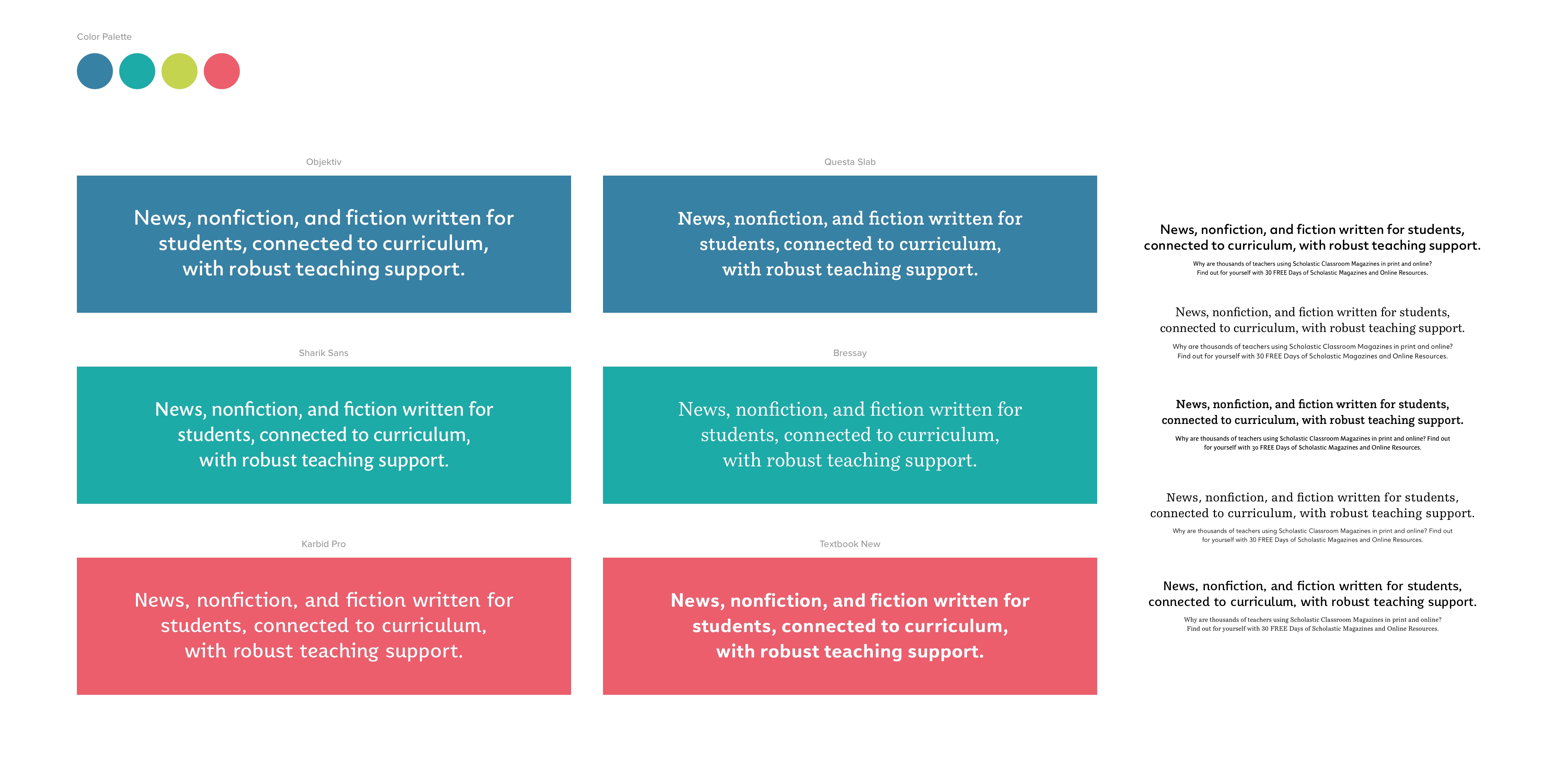
Exploration of colors and typography
In the end, the marketing department decided to introduce an emotional appeal for the first time in many years. (Previously, they focused on product benefits.) We had a particular challenge representing the new message in the home page hero image, because the target age groups and subject matter were so diverse. We needed to find one image that appealed to teachers of kindergarten and high school, math and art. We wouldn't be able to use images of students or classrooms. Instead we settled on an abstract approach, using images that were non-specific but emotionally evocative.
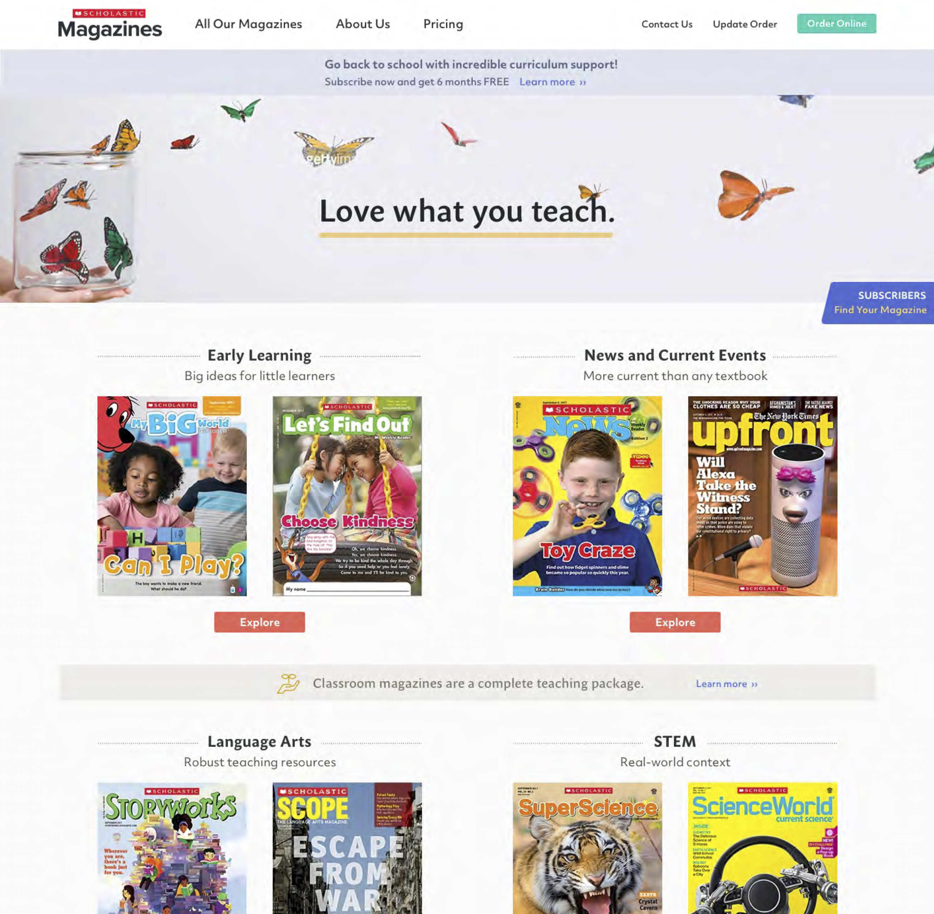
The home page design by one of the visual designers
Once the home page design was approved, the visual designers worked through the rest of the pages, some of which are shown below. We handed them off to the developers.

It was a privilege to be able to help establish a new presence online for the classroom magazine group. I was also pleased that in spite of the short timeframe, and in spite of not being able to do more user research, we were able to follow a reasonable process that started with our customers and that established a good framework for the designs. This helped the team make good decisions in a timely fashion, and we produced a good design that will be much more appealing and usable for our customers.
Next Project ›646-385-3120
achandler20@gmail.com
Based in New York City