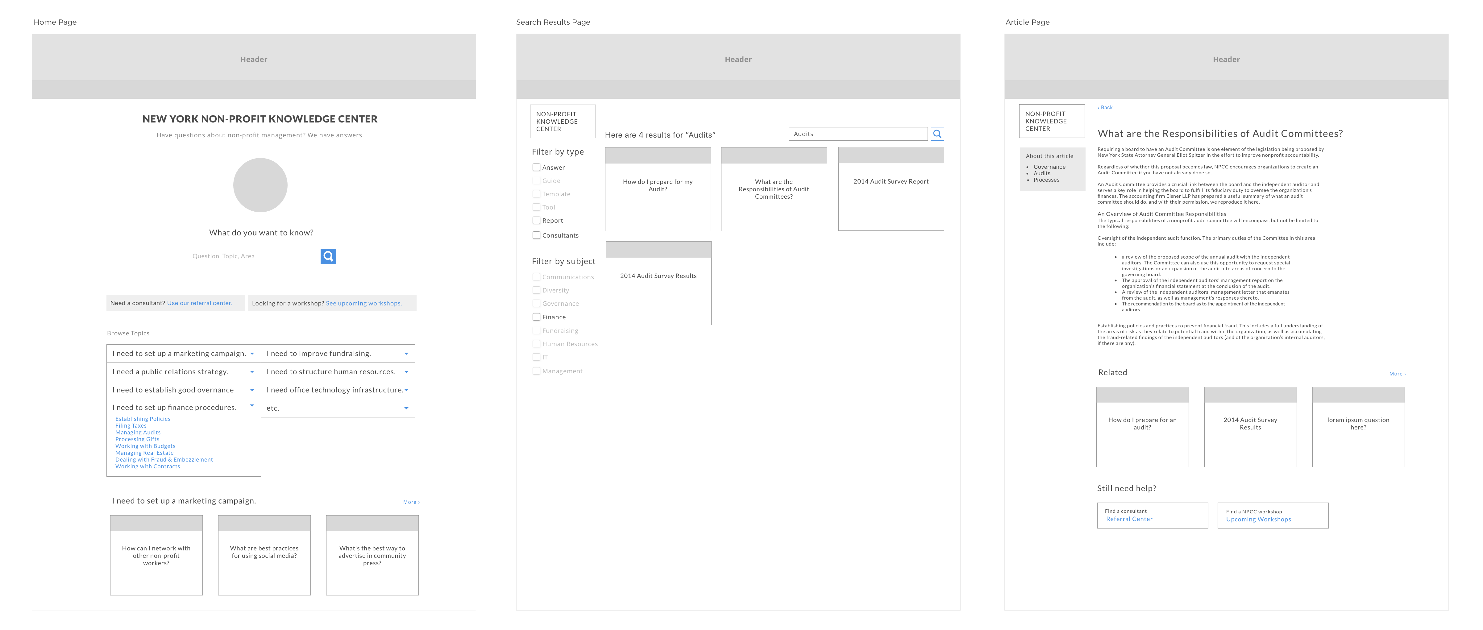
Some of the wireframes of the upgrades Toolbox, or the new Knowledge Center
The Nonprofit Coordinating Committee of New York (NPCC), which provides services to other nonprofits, offered a Nonprofit Toolbox on its website, and they wanted to give it an upgrade. It was a collection of how-tos and advice articles that had been assembled over the years, and the staff at NPCC wanted to repackage it to make it easier to find information. I volunteered for a program in New York City that facilitated pro-bono tech work for nonprofits, and they paired me and some additional team members with the NPCC for this project.
Business ProblemThe NPCC wanted to build their membership, and they had identified the Toolbox as a key membership benefit, assuming they made improvements to its usability. As a digital service, it could also play a role in marketing themselves online via search and other channels, as well as demonstrating the value of membership to potential members.
Digital Strategist
Project Manager
UX and Visual Designer
6 weeks
Wireframes and Visual Designs
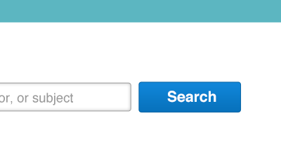
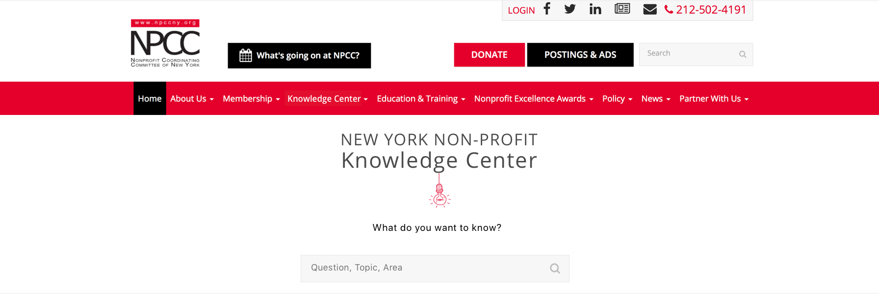
In its current version, the Toolbox presented the visitor with a list of topics in one accordion menu, and the only search was a site-wide search that wasn't useful for Toolbox-specific searches. Anyone who was looking for information would have to expand the accordion panels and browse the topics one by one until they found what they were looking for. The question for me was how best to facilitate discovery, through search and browsing. Additionally, I needed to incorporate a mechanism to promote content to potential members.
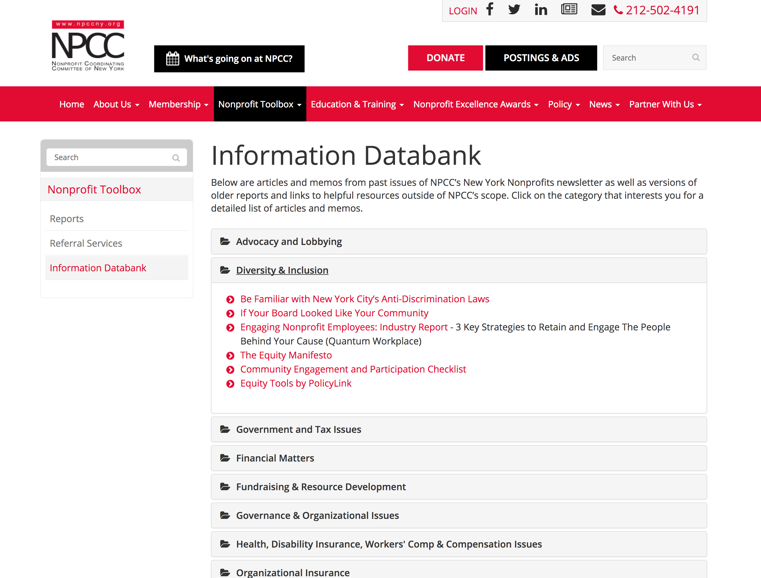
The Information Databank that needed a UX upgrade
My teammates and I started with stakeholder interviews. I had questions about who used the site and why and in what context. Which staff members of nonprofits were the likely users? What would trigger them to visit? What would make a visit successful? I also wanted to make sure I understood the operational context. Who would be maintaining the knowledge base? How actively would it be maintained? Lastly, we checked in along the way with NPCC's technology and website partner, who would be making the updates to the existing site, to understand the technology context of the project.
Armed with answers to these questions I started thinking about the designs. The scope of the project did not include any user research, but we had plenty of information from our partners at NPCC, who were well acquainted with their members and their needs.
A couple of strategic questions needed to be settled. First, what did their goal of making the Tookbox a go-to resource for nonprofits mean for the name? Should we look for a name that was more evocative of a knowledge resource? Second, what did their new mission imply for the content? The articles had accumulated over the years from convenient sources and covered topics that happened to be in those sources. If the Toolbox were truly to become a destination, the member community would have to have confidence that the answer to their question—any question—would be there. How should we organize what was there, and what sort of plan should there be to fill the gaps?
In answer to the first question, I proposed re-positioning the toolbox as the Knowledge Center, a name that was fairly encompassing and welcoming. Organizing the content and filling the gaps, however, depended on work that would extend beyond the term of my main engagement. We could get started, at least, on a new taxonomy, which we proceeded to do.
I designed the wireframes, bringing the search front and center, and I shared them first with my team and then with the team at NPCC.
Some of the wireframes of the upgrades Toolbox, or the new Knowledge Center
One of NPCC's goals was to use the content to promote membership. They wanted members to be able to access all articles, while prospective members and other non-members would have a taste of the content, which would encourage them to join. In other words, the Knowledge Center would be a meaningful benefit to members, which could then be used to promote membership. My solution was to show enough of the experience so non-members got hooked and had to join.
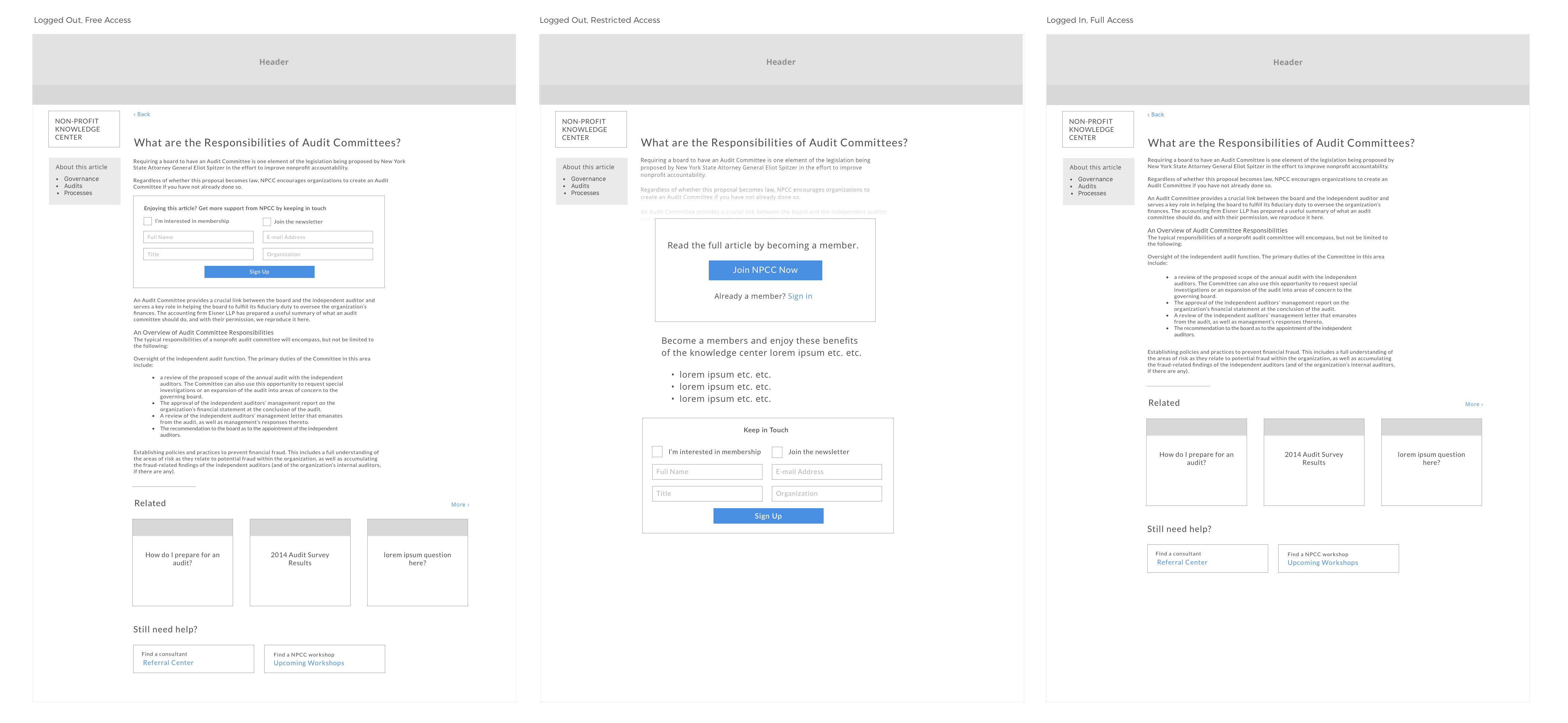
Wireframes for the article page as experienced by members and non-members
Once the wireframes were reviewed and approved, I moved onto designs. I wanted to make it easy for NPCC's technology partners to implement the designs, and so I worked completely within the existing design framework. I worked with the fonts and colors they already had, and I put my design effort into the layout and interaction patterns that were new to the framework. So that the new designs would seemlessly fit into the existing site, I spent a good amount of time reviewing the site, cataloging the elements, and getting a feel for the design logic.
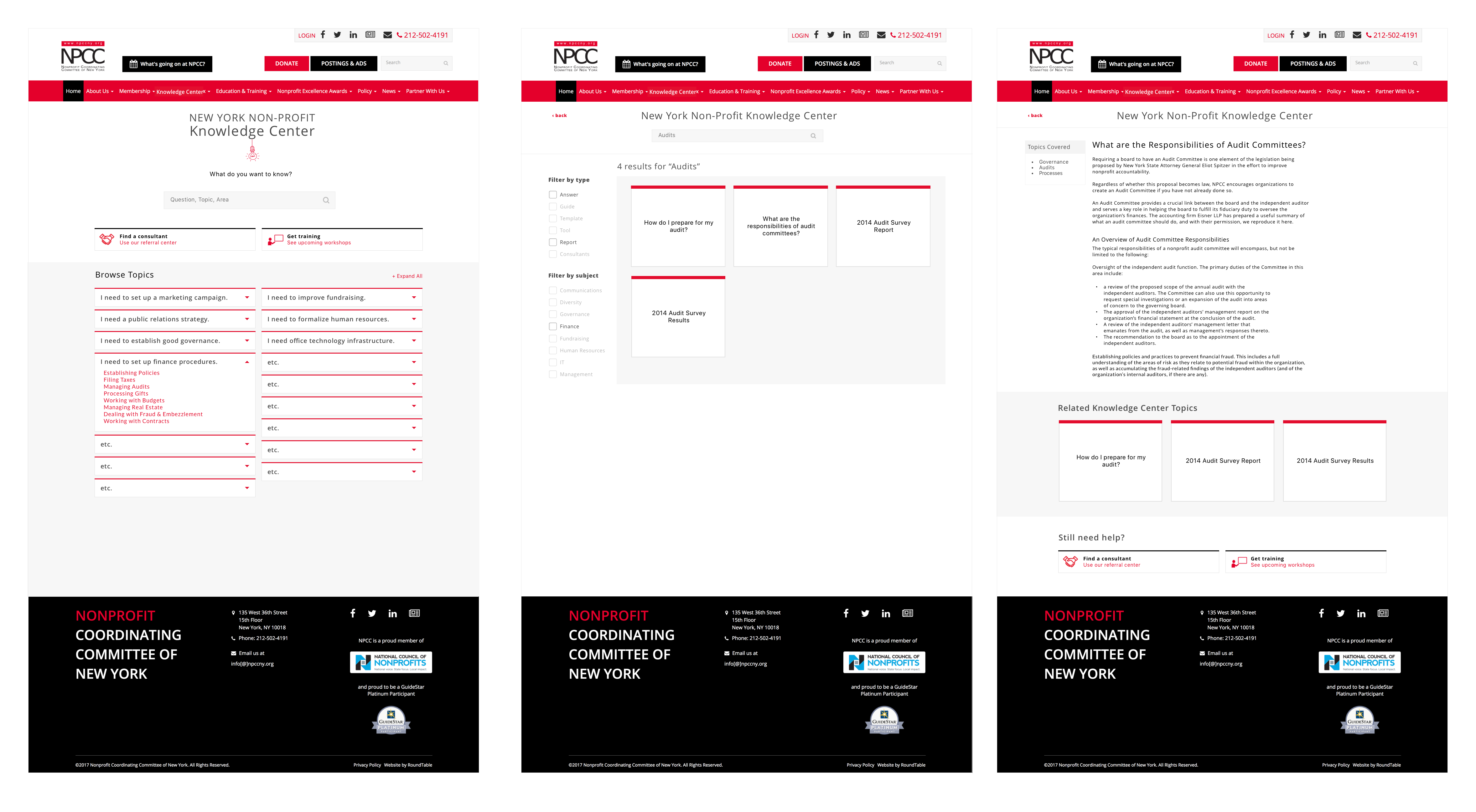
At this stage, once I had a good handle on the core pages, I started elaborating the other pages that would be needed, like various versions of the "paywall" or the "your search turned up no results" page. I also made annotations for the developers, since I would not be working with them directly on the implementation. In general, I made the effort to provide everything they would need to do a smooth implementation, and I made myself available to answer questions if needed.
My partners at NPCC were pleased with the designs. They had everything they needed to move ahead. The implementation was affordable. And in the end, they will get closer to their goal of making the Knowledge Center a meaningful membership benefit and destination for information. Their members will have be happier because they have a much easier time finding information in the Knowledge Center, and non-members will be able to see membership benefits more clearly.
This project was almost ideal for me. It started with a clearly defined design need, which made it easier for me to deliver meaningful work in the timeframe. I was able to find opportunities to ask questions and make suggestions that worked to the benefit of the designs. And I could deliver something that was going to be implemented. Overall, the project went smoothly and my partners at NPCC were happy with the results.
More Projects ›
646-385-3120
achandler20@gmail.com
Based in New York City