The purchase flow experienced by customers subscribing to Scholastic's Classroom Magazines included complex forms and easy ways to fall out of the flow. The experience also suffered from any comparison a customer might make with other eCommerce experiences. As part of a redesign of the main Scholastic Classroom Magazines website (see A Website Redesign in this portfolio), we undertook an overhaul of the flow.
Business Problem: Online subscriptions were becoming a bigger percentage of the business. It was critical to reduce any real or perceived friction in the flow in order to support the growth of the online business as much as possible, not to mention addressing the usability issues in the flow and the potential for losing some subscribers because of them.
Visual Designer
User Researcher
Marketing Lead
Business Analyst
Program Manager
UX Designer and Team Lead
6 weeks
A Prototype (for testing) and Visual Designs
The order process had to offer a customer, perhaps a school administrator, the option to order multiple magazines, with an additional option to divide each subscription among multiple teachers. The main UX challenge was thus organizing the presentation of options and collection of information in a way that made sense to the customer. To take one question, did a customer organize their thinking with a list of teachers (and then their magazines) or did they start with a list of magazines (and then the teachers for each)?
Below is the order form we were tasked with updating.
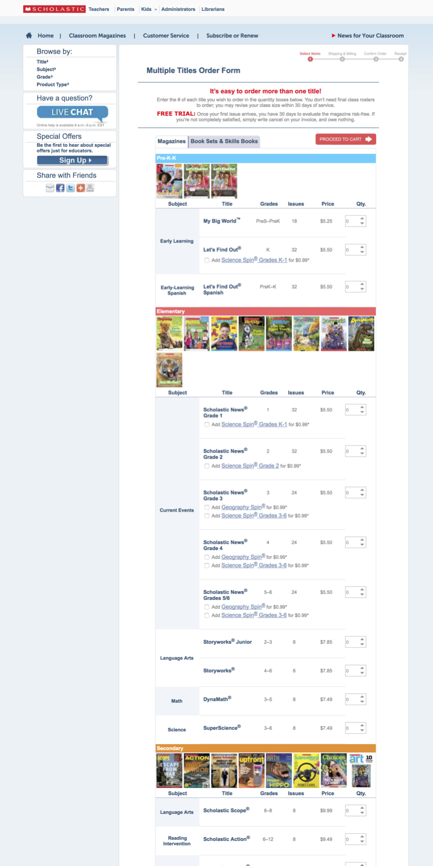
The long and complex form that was to be overhauled
We already had plenty of data on our customers—teachers and administrators—so we planned to check in with our users once we had something to present to them. We consulted analytics and sales data, and we conducted a competitive analysis. We worked on differentiating the personas and understanding their needs. We also had the work from the first phase of the project, in which some of the basic check-out patterns had already been elaborated.
In the course of my research, I learned that a typical scenario involved circulating a spreadsheet among teachers soliciting their magazine order requests. I knew that the easier it was to transfer that information from the spreadsheet to our form, the better. The idea of an order form became my starting approach—a design hypothesis that I would later test. (The notion that customers might somehow convert their spreadsheet directly into an order was tantalizing but ultimately set aside.)
We got to sketching, first on paper, and then on giant post-its that we used in the absence of whiteboards in the office. Team members stopped by alone or in groups as we talked through the issues. We started with the idea of a form that customers could fill out in any order they chose, recipients first or magazines first. We also thought about how we would align with the existing single-magazine flow.
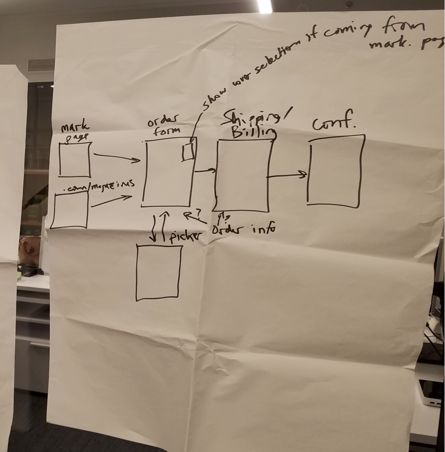
A sketch hanging in my office
Early in the process I started transferring the sketch ideas into wireframes, which I did using Axure. I started in Axure, because I knew that when we showed the flow to customers, we would want a functional prototype, which would facilitate higher quality feedback.
At this point, the team got word that we had to cut the scope of the project.
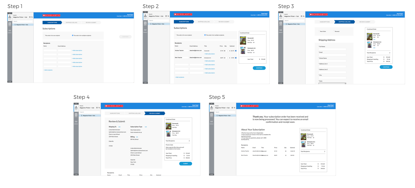
Practically speaking this meant that instead of an open order form, we took the approach of a two-step process, starting with magazine selection and followed by a step to collect recipient names.
With this latest change, we knew we would benefit greatly from testing with our customers. As we had been working, our user researcher had been working with the marketing department to identify some customers, mostly school administrators, who had placed multi-magazine, multi-teacher orders in the past. We arranged with four of them for video-conference sessions, and we wrote our session script to take them through a task-based scenario with the Axure prototype.
Overall the prototype performed very well in the tests, and the participants responded positively as well. We identified a few points of confusion that related to quantities, and we adjusted the first two screens in the prototype, which now looked like this (below).
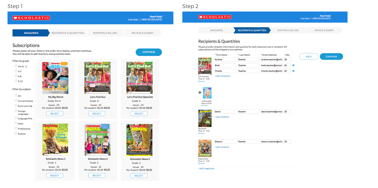
Updated wireframes in Axure
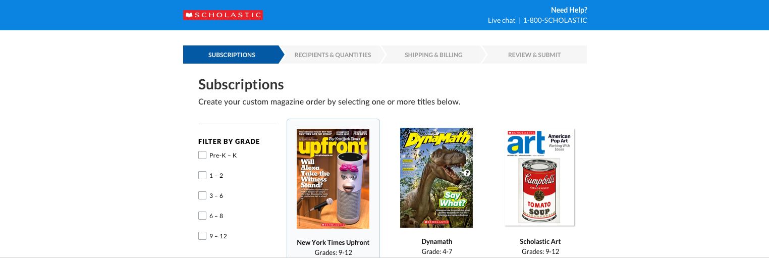
The visual designer got to work, picking up from the prototype to create pixel-perfect designs for the development team.
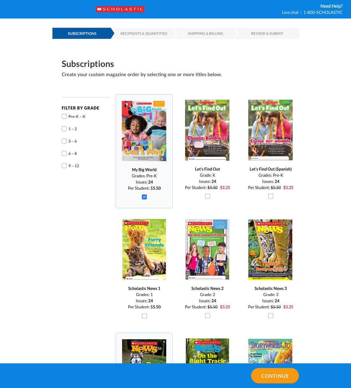
The final design for the first page of the flow, the magazine chooser
It's always disappointing, although not surprising, when a project's scope has to be reduced, but in this case I was able to pivot to something that was perhaps better. I took the opportunity to simplify the experience, breaking it into steps that performed well with the customers in the test sessions. It will be a major improvement over the previous flow.
Next Project ›
646-385-3120
achandler20@gmail.com
Based in New York City